15+ Real-Life Examples of ClickFunnels (Landing Page Designs) in Action!
- By
- Last updated:
- Leave your thoughts

ClickFunnels (along with the likes of LeadPages, Instapage and UnBounce) is one of the leading tools for creating stunning landing pages, i.e. pages designed to convert visitors into sales, leads, email newsletter sign ups, etc. If your website has a clear puprose, an effective landing pages can be worth every ounce of money, time and effort spent on it.
Marketed as a tool you can use to “Quickly Create Beautiful Sales Funnels That Convert Your Visitors Into Leads And Then Customers”, and with over 110,000 users, ClickFunnels is clearly one of the best! But just what kind of pages can you make with it? What kind of designs have other users created for their landing pages? Glad you asked! Below, we’ve put together a list of over 15 of the best examples we can find.
↪️ Note: interested in learning more about the various landing page builders available? Here’s our comparison of LeadPages, Instapage and UnBounce, and here’s our comparison of Leadpages, OptimizePress and ClickFunnels.
Listed in no particular order – Enjoy:
Note: abbreviations used below include CTA (Call To Action); CTR (Click Through Rate); and LP (Landing Page).
MIG Soap
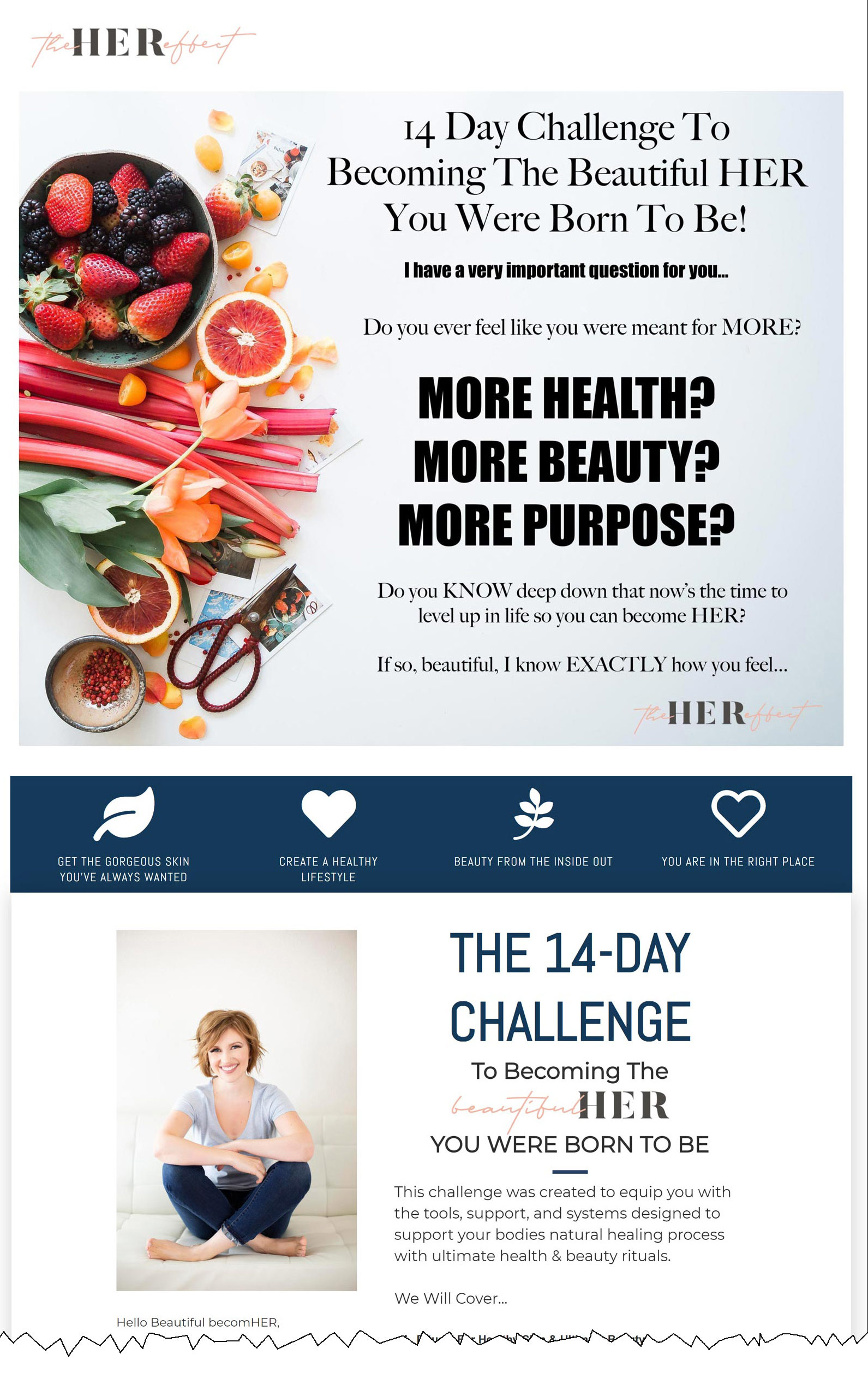
A central column flanked by white boarders gives prominence to the message for this landing page: 14 Day Challenge To The Beautiful Her You Were Born To Be. This is followed by a serious of questions designed to engage the reader and evoke action: “Do you ever feel like you were meant for more?” The questions are all set up to be answered in the affirmative. These type of questions, cleverly, act more like statements the reader cannot fail to agree with, encouraging the reader to listen to that inner voice we all have that tells us to be the better you. This is all spaced out against a vibrant picture of fresh fruit and vegetables. The purposeful use of space creates a clean image that reflect the clean lifestyle that is being sold. This is followed by a page outlining what you will receive while undertaking this challenge, keeping with the clean, spacious aesthetic as the previous page. We then have testimonials in support of products customers have bought. Having a challenge like “The 14 day Challenge” is a great concept to engage your audience. A win for them is a win for you.
Funnel University

Russell Brunson, the man behind Funnel University, is in full charisma mode here, in a “leaked” video from one of his conferences. The video is well produced, and Brunson has the high energy you associate with entrepreneurs. A video done well, like this, is impactful and creates an energy and excitement you associate with the brand. They capitalise on this by having the CTA directly below. This pairing works well together, priming the audience then presenting an opportunity to act.
Perfect Audience
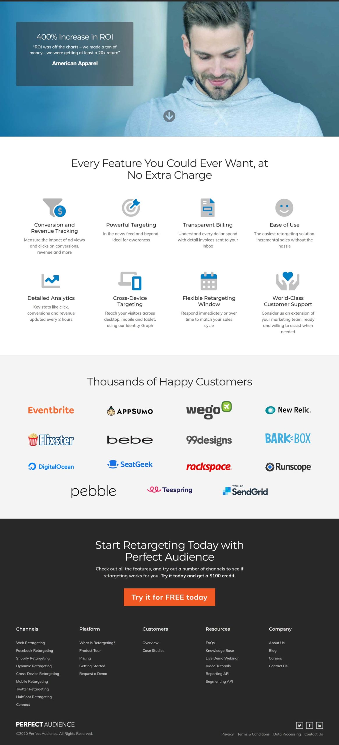
In these uncertain times, free offers are a big draw. And this is what Perfect Audience does well with its “$100.00 credit” and “free trial”. The colour scheme used is reminiscent of Facebook’s simple blue and white, giving a sense of familiarity. And everything is spaciously laid out. All in all, this is a very clean looking LP with hardly any text, which translates into less hurdles and a faster conversion rate.
American Orchid Society

As with Perfect Audience, although less aesthetically pleasing, American Orchid Society makes the most of enticing its audience with a free gift. They have kept the CTA simple by only having two fields to fill out: name and email address. The testimonials are effusive but a little dry. Social proof in the form of profile pictures alongside the extolment text, or a screen grab from, say, a tweet have more impact than a name and text only format.
Podcasting Guest Mastery
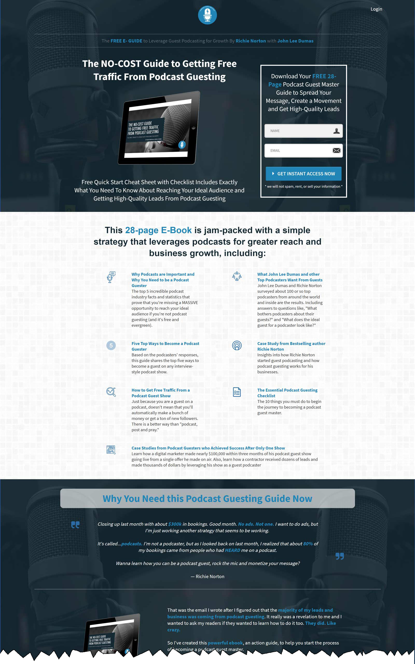
What Podcast Guest Mastery does well is focus on the free give away — well almost free, it costs the user their name and email address. This is a great strategy for conversion, especially when the free gift is a digital product and doesn’t involve any manufacturing or shipping. They use the strapline “Why You Need This Podcast Guesting Guide Now” to create a sense of urgency and necessity, all adding up to higher conversion rates.
ReGreen
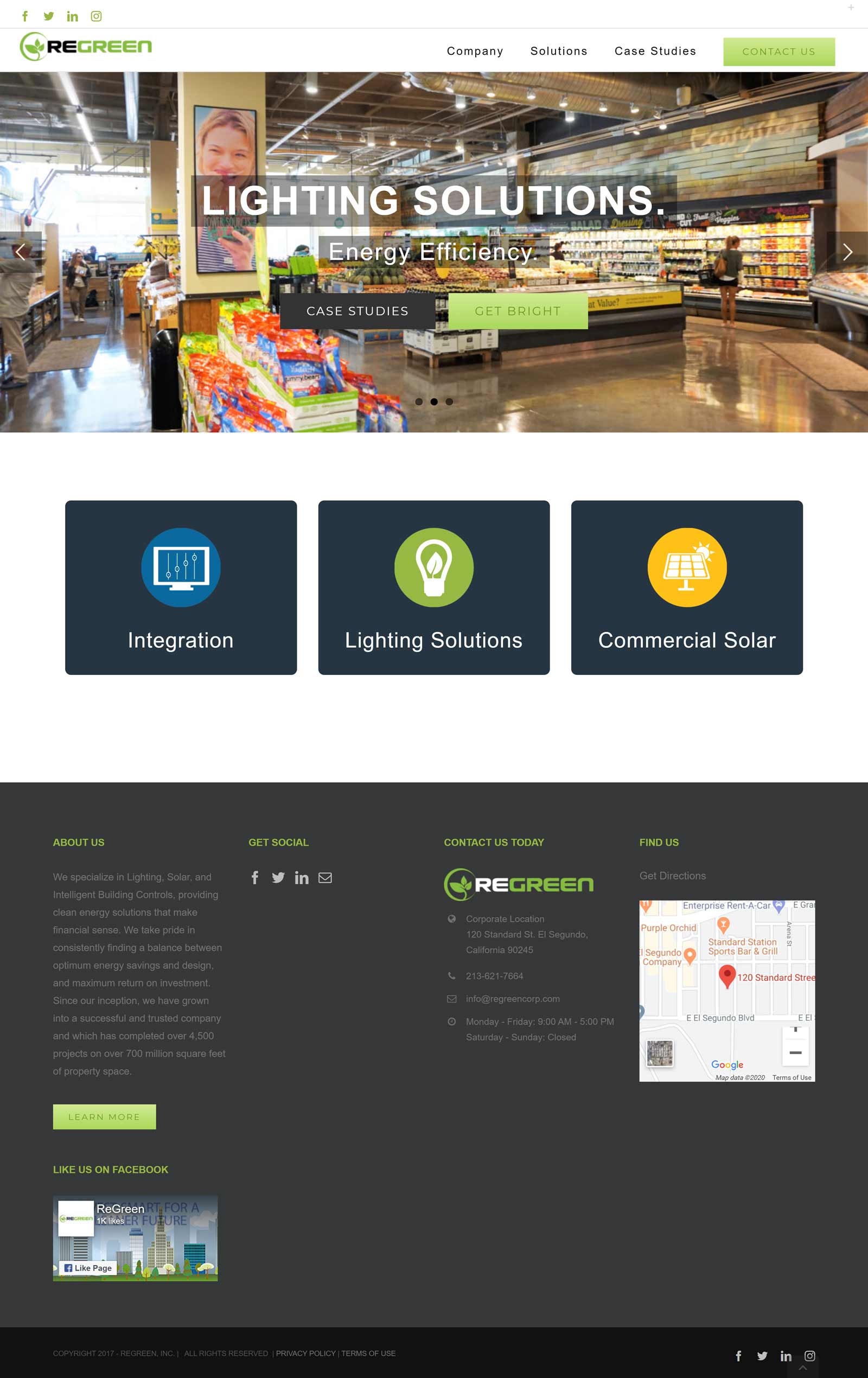
ReGreen has a carousel of three fairly underwhelming photos, which set the tone for a basic looking LP. This is all easily fixable with a little care and attention. If you are using large photos that cover so much of your LP real estate, then make them visually arresting and eye-catching — especially when these are the initial images your audience will be greeted with. The images used undersell what is an interesting product. I like the cards below, flipping when your cursor moves over them, but again they could be made to look more interesting. The ideas used in this LP are okay; it’s the execution that lets it down.
Activation
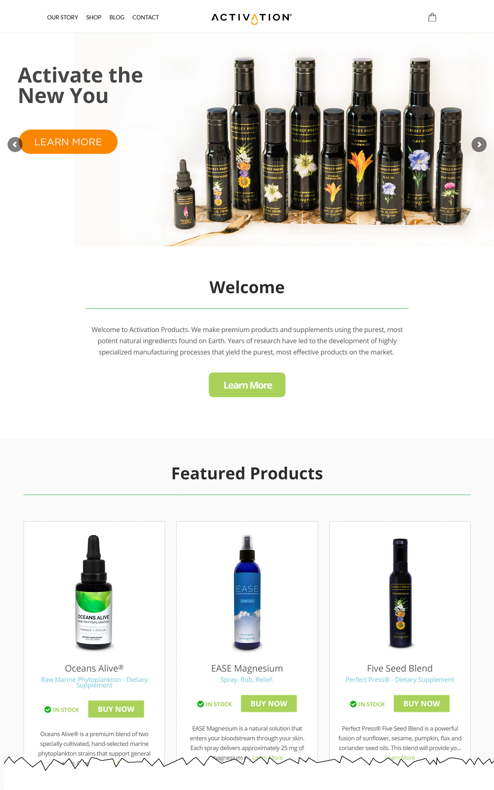
Activation’s aesthetic design is one of space and simplicity, with a carousel consisting of two pictures depicting their products and a “learn more” button on each. A small scroll down takes you to the CTA, where you have three fields (first name, last name, email address) on a background picture of a tablet displaying the Activation page for smoothies. This reinforces the CTA for a free smoothie guide. The LP is light and breezy — no need for paragraphs and paragraphs of text here. This all translates into quicker conversions. Keep it simple!
Envision
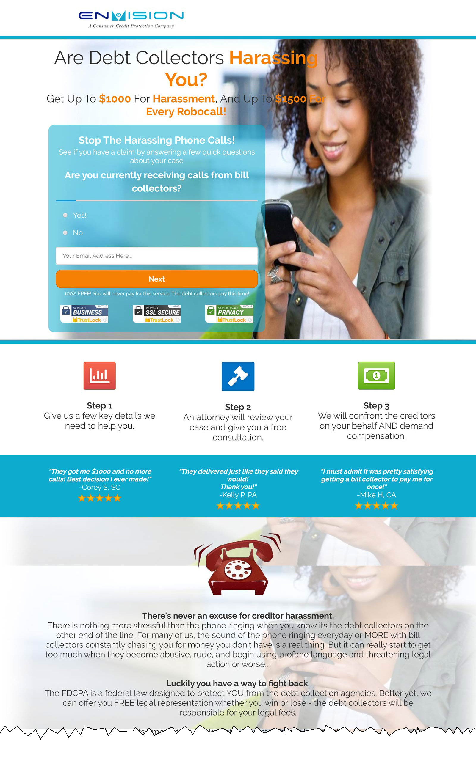
Envision’s landing page has a Call to action (CTA) in the form of a simple yes/no question foregrounded, and an email field. Simplicity is key here, so instead of having a list of questions to scroll down, they are fed to you one-by-one by clicking the next box.This is less intimidating and more engaging for the user. All this is situated by a large picture of a lady smiling while using a mobile phone. The picture creates a sense of positivity and the possibility of happy solution to finance troubles. The bottom right of the page is an instant messaging box to chat directly to one of their employees. This gives a point of contact in establishing a relationship with the customer. Centred at the bottom of the opening page, it has three steps laid out, each headed by icons visually representing its respective step. Setting out the process in three easy steps, from what could be a complex process, gives the reader a sense control and assurance in using Envision as a financial service. It’s all about creating the right fit with the customer and creating a sense of what they need, and this is what Envision’s LP does well.
Rental History Reports

This is not strictly a LP, but it has enough elements of a LP that we decided to include it. There are two CTAs, one at the top of the page and the other at the bottom of the last page. The CTA at the top did little to attract my attention and wasn’t compelling enough for me to click on the button. The CTA at the bottom of the page does slightly better in highlighting itself and enticing me to act — but only slightly. And social proof is scant, with only one testimonial. But on a more positive note, the layout is clear and the information sections all flow sequentially, giving an easy-to-follow explanation of what services they offer. There is also a direct point of contact through an I.M. box.
0-100k
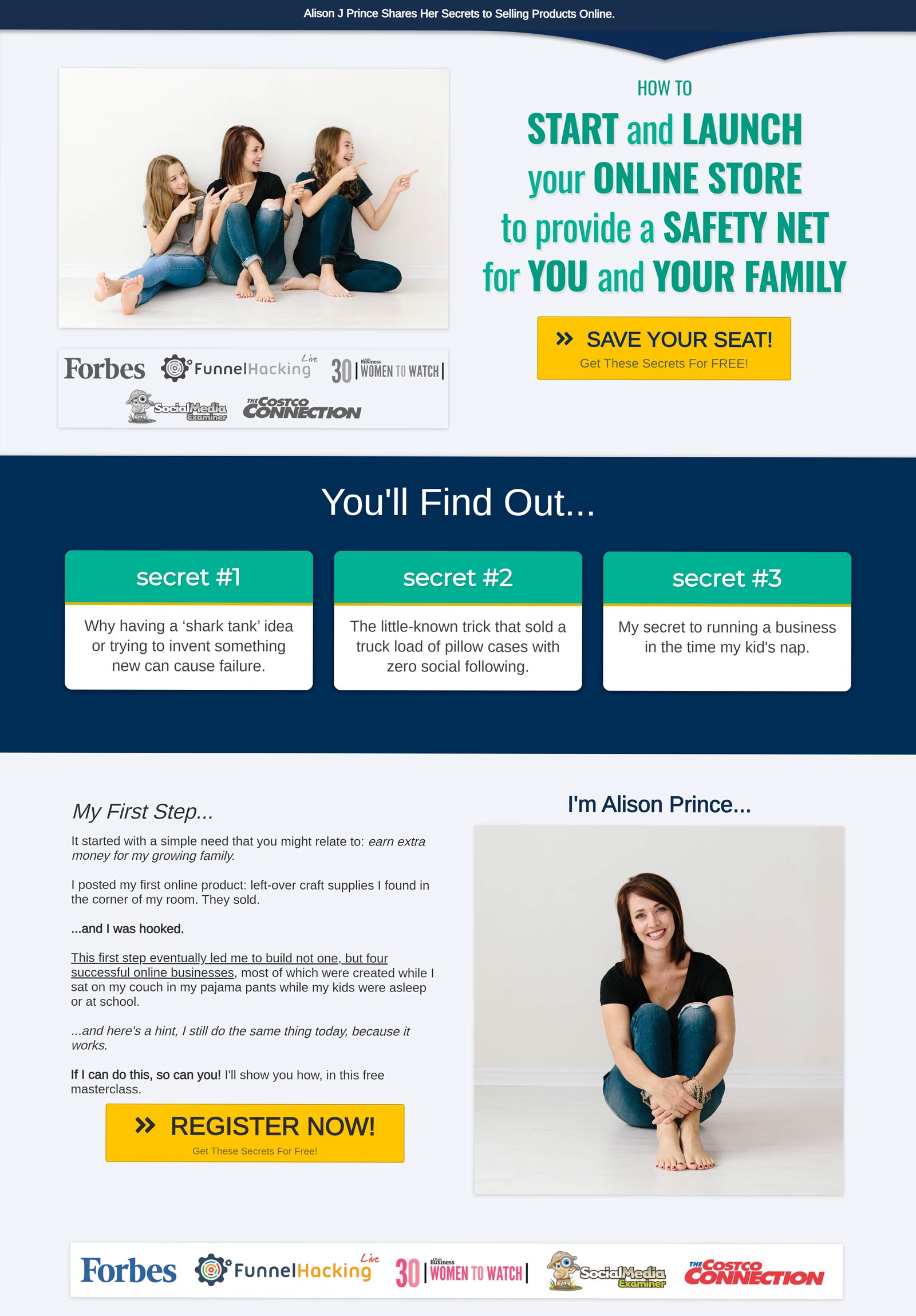
The strength of this LP is its simplicity. It has a clear message telling you exactly what is being offered in one sentence, and its CTA directly below. (mention picture of Alison, 3 boxes of text adding a little more information. It’s all laid over two pages with minimal text to picture ratio, which works in its favour)
Discover MBCA
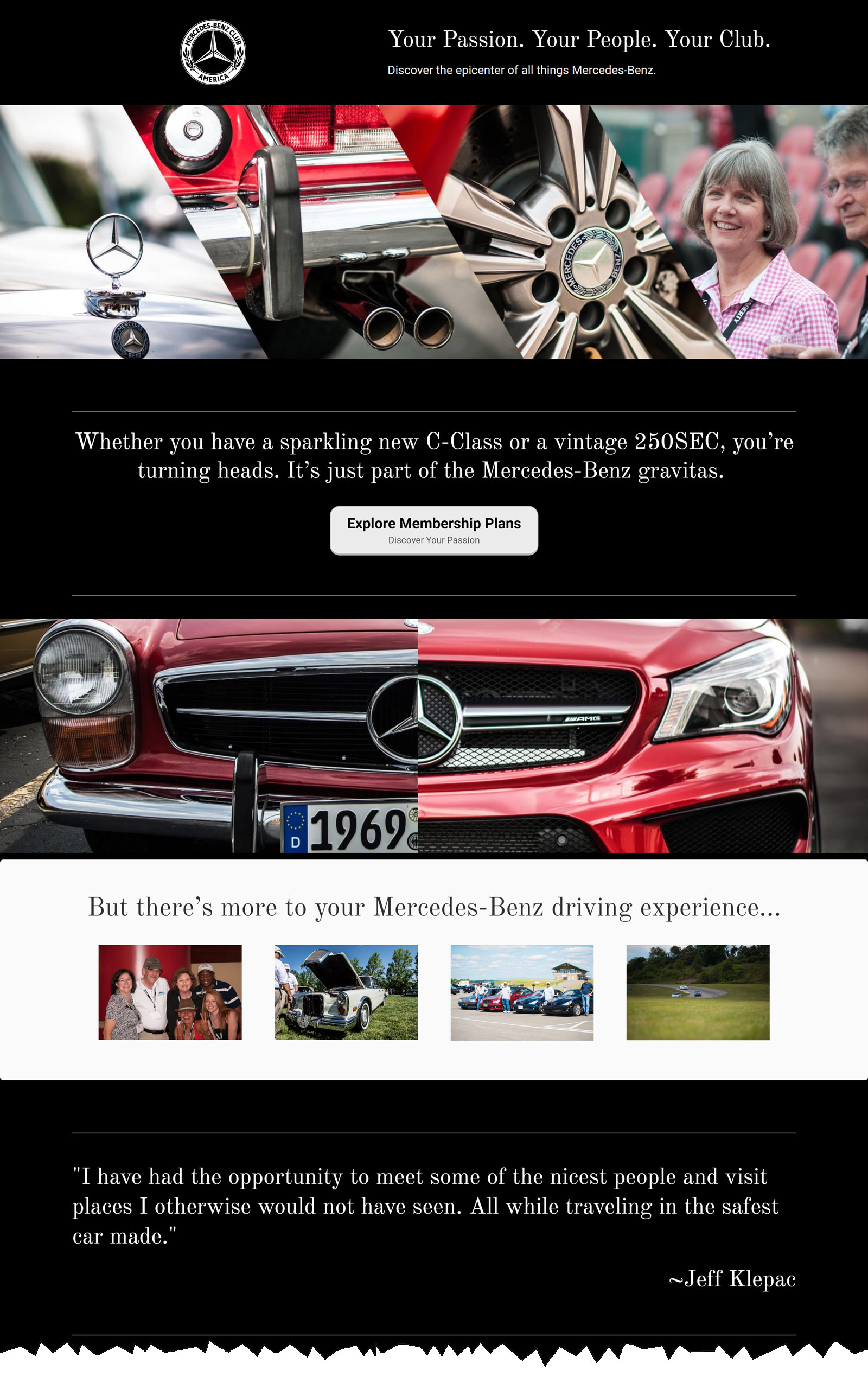
My favourite type of LP is a LP with minimal text and eye-catching photos, and Discover MBCA have not disappointed. There are two horizontal strips of photos taken from various parts of Mercedes cars, set on a plain black background. It’s kept stylish and sleek, as we have come to know Mercedes cars. In between the two strips, your eyes naturally fall to the CTA — the positioning works well here. And if that doesn’t catch you, a finger roll on your mouse takes you to the list of benefits and another CTA at the bottom. This one is the colour inversion of the previous one and has three testimonials at the bottom. Normally I prefer social proof in the form of a social media screen grab or picture with quote, but considering the aesthetic and brand, this wouldn’t work quite so well here.
Mixergy
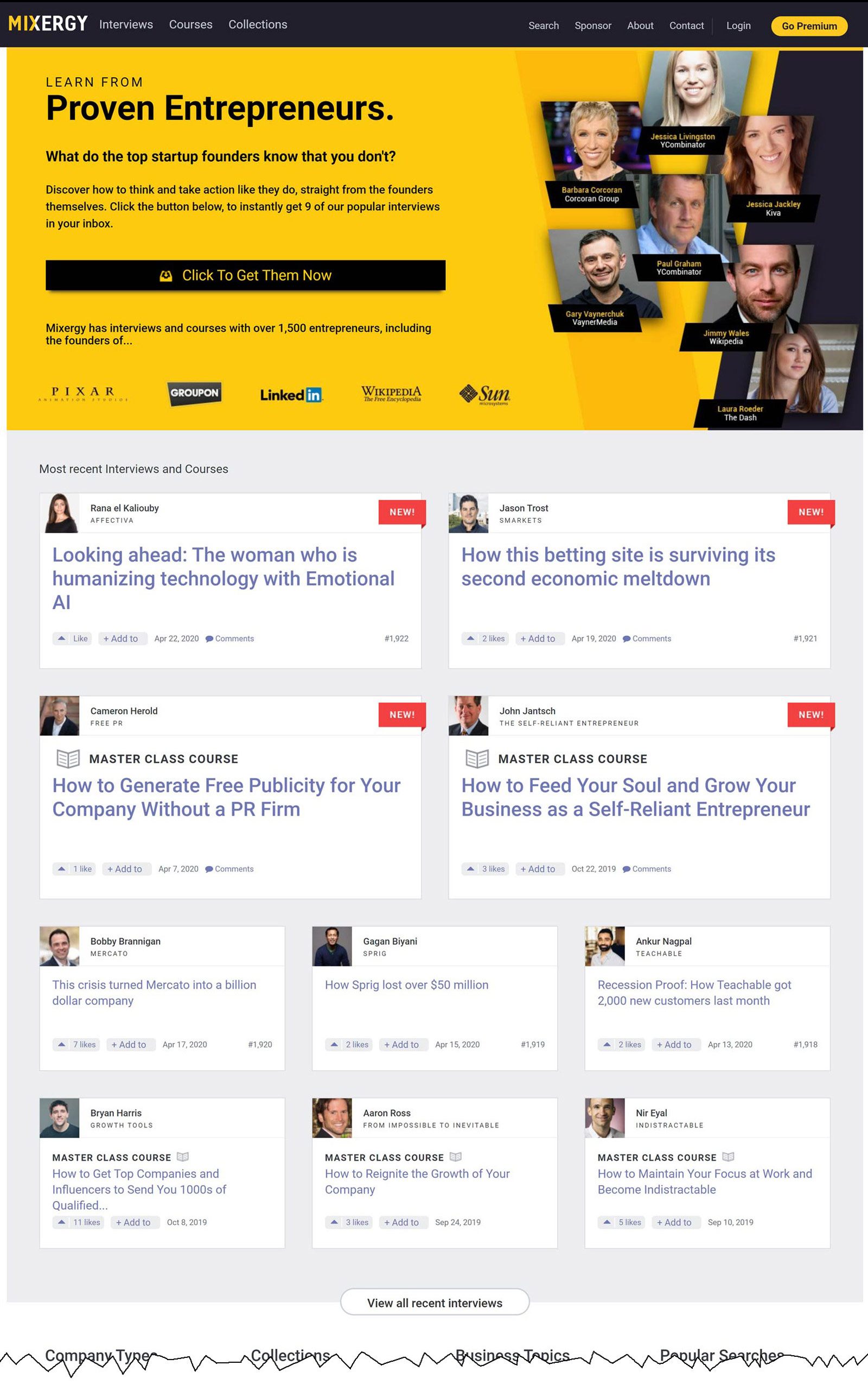
With Mixergy it’s not so much the layout but the content that reels you in. Its CTA is set in a bright yellow box adorned with profile pictures from entrepreneurs like Gary Vaynerchuk and wikipedias’s Jimmy Wales — where you are able to access interviews given by both. And to the bottom of the click-to-get-them-now button are the logos of Pixar, Linkedin and other well known companies that have provided content for Mixenergy. This establishes confidence and a level of professionalism from the offset. The following pages have various interviews for you to sample, but the big hitters like Jimmy Wale and Gary Vaynerchuk can only be accessed by their CTA. With big names such as these, and a simple and clear CTA, it’s a sure win for conversion rates.
Employee Matters
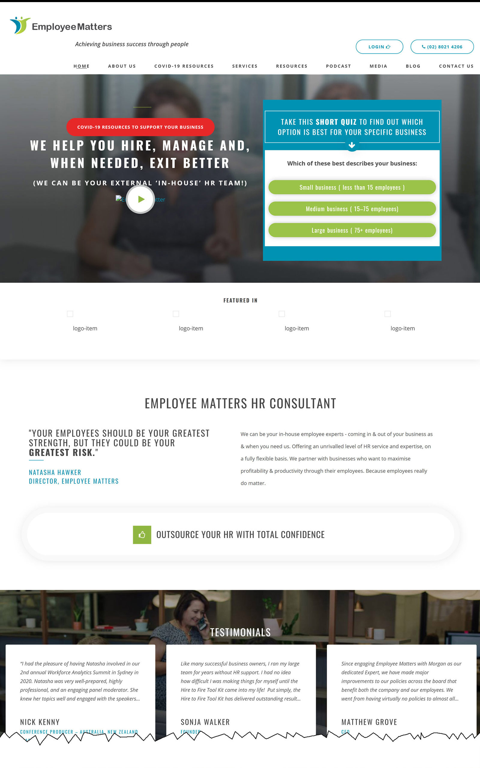
On the first page a video featuring Natasha Hawker, the company director, introduces the audience to Employee Matters. Opting for video media instead of a traditional text-photo bio has become more common on LP. It’s a more engaging format than text alone, giving its audience a sense of the person rather than an amorphous company. This increases retention and the likelihood the user will stay long enough to act on the CTA. The video also works alongside the CTA, Where Natasha explains the quick quiz (CTA) that will fast track you to what you need.
CHTO
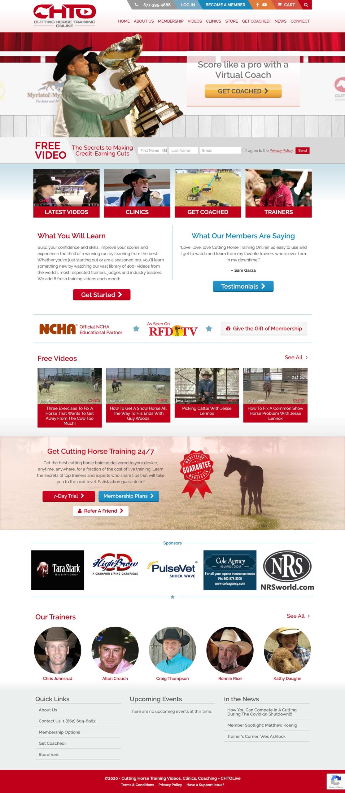
The mouthful that is Cutting Horse Training Online opt for a carousel of four slides. Each slide has a CTA, and all four CTAs differ in their destination, taking you to various pages: you can visit one of their upcoming clinics or have a “Free 7-day Trial”. This provides options rather than having a one-size-fits all CTA for its audience, where some may feel like opting for something less committal, like the seven day free trial, than committing to purchasing coaching videos.
Market Traders Institute
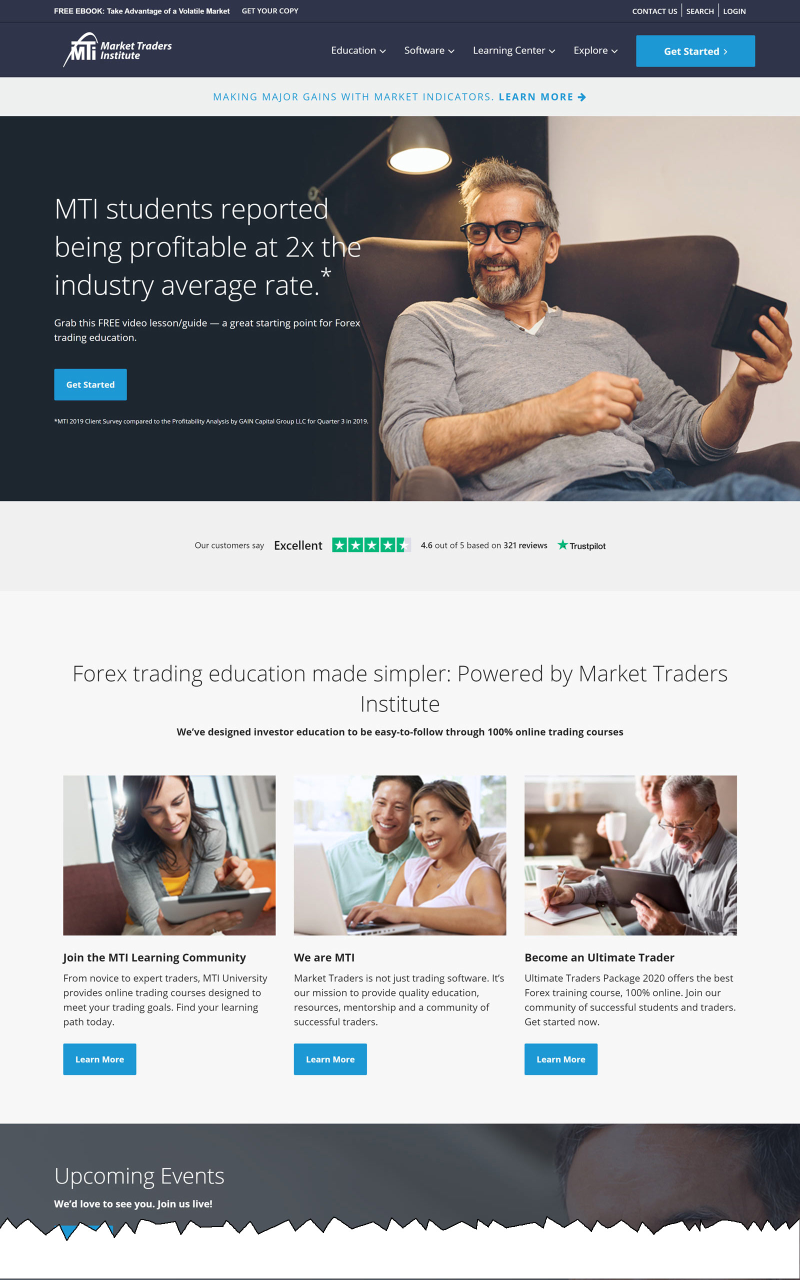
MTI make full use of their space with wide-format photos and two CTA buttons spread out over their first page. They have a point of contact through their instant messaging box and there is a general ease of navigation throughout their LP. This all translates into a better user experience and higher rate of conversion. Too much text and difficult navigation can be hurdles preventing the user from staying on the page long enough to act on your CTA.
Related Reading:
Seen any other great examples of Clickfunnels?
All comments are held for moderation. We'll only publish comments that are on topic and adhere to our Commenting Policy.