
How to Change the Look and Feel of WordPress
One of the very best things about WordPress, as opposed to just about any other platform available, is the freedom it gives you to completely customize your site. In short, almost anything is possible — and the more you know about the subject, the easier changing the look and feel (and even the general functionality) of your site becomes. What’s more, a lot of this customization is easy to do, and only requires knowledge of a couple of tools; from there, the only limit is your imagination! The goal of this guide is to point you in the right direction to get started on changing things for yourself — regardless of your current level of website-customizing skills. (Note: For more guides in the same series, head to the main WinningWP Guides page.)
-Note: WinningWP content is free to all. If you make a purchase through referral links on our site, we earn a commission (learn more).
WordPress is the market-leading tool for making websites, and a major contributing factor to this is how easy it is to change the look and feel of a WordPress website. Regardless of the type of website you want to build or the features you want, you can almost certainly use WordPress to get the look and feel you’re after.
WordPress makes it easy and affordable to create a professional and unique website, and any two WordPress websites can be technically very similar, but look completely different.
This guide will cover everything you need to know to confidently change the look and feel of WordPress. We’ll start with the least technical (but least powerful) methods of customizing your website, and then move through to the more technical (but more powerful) methods. If you’re already a confident WordPress user and want to get right into technical customization, you should skip the first three sections. Otherwise, let’s start at the very beginning!
Choosing a WordPress Theme
Before we start talking about changing the look and feel of WordPress proper, let’s briefly talk about WordPress themes. When we talk about changing the 'look and feel' of WordPress, we’re referring to customizing the details. Here are some examples:
- Changing the font and size of the site title.
- Changing the color of links.
- Adding a slider to your homepage.
If you want to dramatically change the look and feel of your WordPress site, you should look for a new WordPress theme. There are thousands of WordPress themes available to suit all tastes and types of websites, so if you want major changes it’s typically easier to find a new WordPress theme that better reflects the look and feel you’re after, and then customize the details from there.
Choosing a premium WordPress theme typically also entitles you to developer support for small changes to the look and feel of your site, so this is something else to consider.
We have detailed guides on how to choose a WordPress theme and where to buy WordPress themes, so these should be your first ports of call if you’re considering a theme change.
If you’re confident your current theme is the right one, and you only want to make tweaks, fantastic! Let’s get right on with changing the look and feel of your WordPress site.
Using the Customizer to Edit with a Live Preview
WordPress has a number of built-in features to make changing its look and feel significantly easier. The most important of these is the Customizer. As the name suggests, this is a feature that makes changing the look and feel of your website a lot easier.
The Customizer lets you change a number of preset options, and gives you a live preview of how your site will look, so you can preview before making any changes.
The Customizer can be added from the WordPress Dashboard by heading to Appearance → Customize. What exactly you’ll be able to customize depends on which theme you're using, but customizations typically available include:
- Customize visuals such as the site background, preset color schemes and any header images.
- Make simple edits such as changing the site title and description.
- Change which page of your site displays as the homepage.
It’s up to each theme to include support for specific Customizer features, so your theme may have more or fewer customizations available -- it’s just a case of loading up the Customizer and finding out. Given the Customizer gives you a live preview and you can cancel any changes, playing with the customizations is a perfectly legitimate way of finding out how it works.
Let’s walk through how to make some common Customizer changes, using the example of the most recent default WordPress theme.
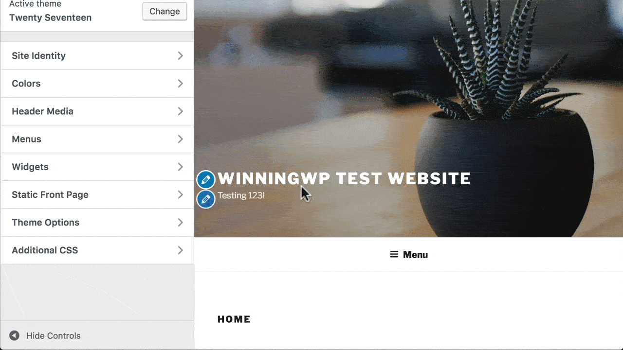
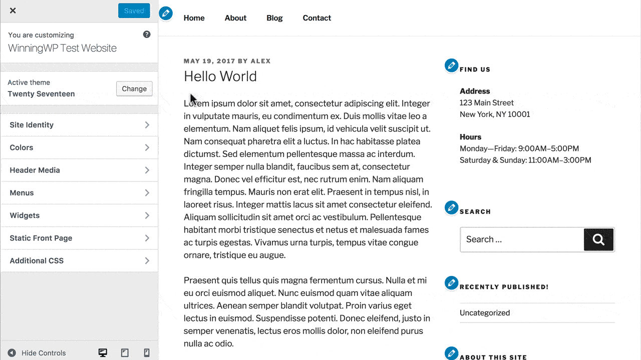
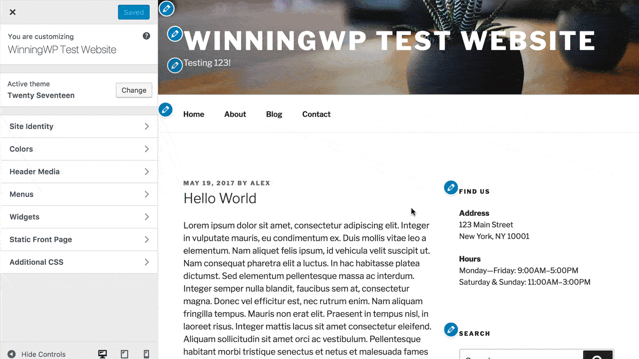
Start by loading up the Customizer by clicking Appearance → Customize. The left-hand panel will show what you can customize, and the right-hand panel will show a live preview of your site.
You can start making changes either by clicking on the headline category for what you’d like to change, or by clicking on the ✏️ pencil icon in the live preview. From there, make the specific changes you’re after, and you’ll see them show up in the live preview immediately. You can then make further changes, test how your site looks on mobile and tablet devices by clicking the icons in the bottom left, or press Save & Publish to set your site live.
To change the Site Title, for example, you would click Site Identity, and then under Site Title type in the changes you want. You could then proceed to set a tagline, or use the checkboxes to hide either. Your theme may have additional options available at this point, including adding a logo image and adding a site icon. If your theme specifies recommended dimensions, WordPress will even let you crop your images on upload -- making the process even easier. When you’re happy, Save & Publish.
Most Customizer options are similar to the Site Title. You can change the color of the background of your site by clicking Colors, clicking the color picker and choosing the color you want. Note: You can also change the opacity using the slider on the right side, or get a specific color by entering an HTML hex code.
You could then add a background image by clicking Background Image, uploading the image you want, and choosing from the preset options to get the positioning, and repeat settings that suit your image. Again, Save & Publish when you’re done.

One of the most useful Customizer settings is the Static Front Page option. Click this, and you can choose whether your site’s homepage displays latest posts or a specific page you’ve created. The option for latest posts will be the regular blog setup, with posts displayed in reverse chronological order. If you select 'A static page', however, you can set your site’s homepage to be any of the pages you’ve created. Use the dropdown to do this or Add New Page to create a dedicated new page. You can’t edit the content from the Customizer, but the live preview will show you how your site will look.
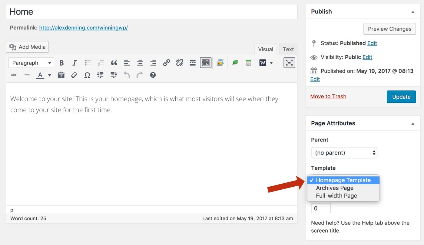
Many themes come with front page designs that are even more customizable, or support the use of drag-and-drop page builders that allow you to get precisely the look you want. To activate these, you may need to head to Pages, edit the page set as your static front page and set the Page Template to 'homepage' or similar. Save Changes when you’re done. We’ll go into more detail on page builders later in this guide.
The Customizer also lets you control your site’s Menus and Widgets with the live preview. We think the non-Customizer settings for both of these are easier to use, so will cover these separately in the next section.
The great strength of the Customizer is its intuitive, easy-to-grasp settings, so the best way to make use of it is to try out the settings. As mentioned, what each theme makes available in the Customizer varies, so you may find more options available, or you may just have the above. Either way, the best way to get to grips is to get stuck in!
You can extend the Customizer with a number of great plugins. You can install any of these from the WordPress Dashboard by heading to Plugins → Add New, searching for the name of the plugin and then Installing and Activating. Here are our picks for adding extra functionality to the Customizer:
- Easy Google Fonts lets you add any of the hundreds of free fonts available in the Google Font Library to your site. This is a great plugin for getting full control of the typography on your site.
- Unique Headers is not strictly a Customizer plugin, but it complements the Customizer’s features: If you’ve set a header image, but want to change this on a post-by-post basis, then add this plugin and you’ll be able to do so when editing any post or page on your site.
- Customizer Reset is a very simple plugin that adds a reset button to the Customizer. Use this if you want to start over with your customizations!
The Customizer is hugely powerful already, and, in the coming years development work, will be focusing on making it even more powerful. For making basic changes to your site with a live preview, this is the best way.
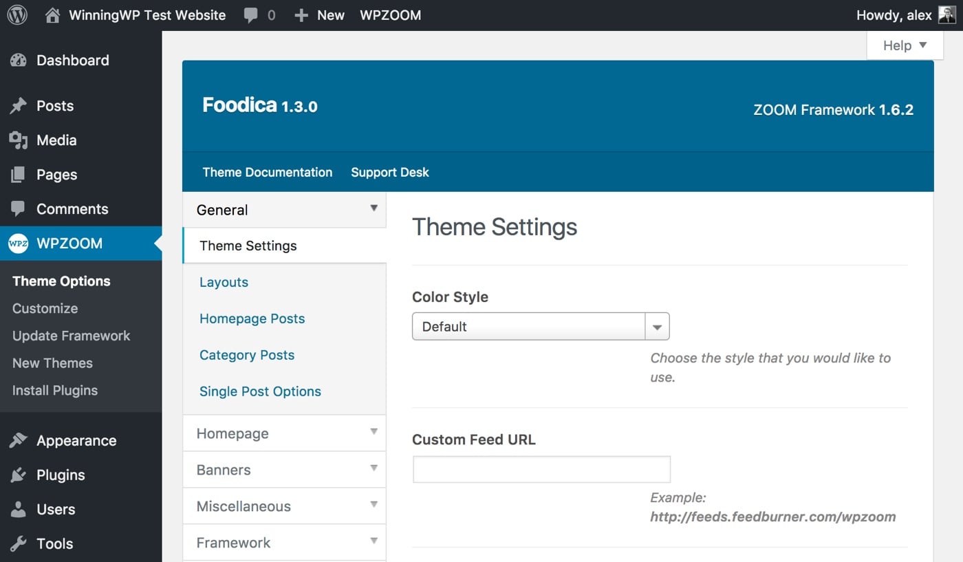
Using Theme Option Panels
Before we move on, let’s also talk about theme options pages. Theme developers are phasing these out in favor of more extensive options in the Customizer, but a lot of themes still include these, so they’re worth a mention. Theme options pages are typically used for general theme setup and data input. Each is different, but you’d typically have options including:
- choose layout options
- add social media links
- general homepage setup (including sliders)
- enable or disable specific theme features.
If your theme has an options page, you’ll either find it under Appearance → Theme Options, or as a separate menu on the WordPress Dashboard with either the name of the developer or the name of the theme.
Similar to the Customizer, theme options pages only let you change the look and feel of your WordPress site by changing preset parameters, so you’re limited in your customizations by what your theme makes available -- if anything. Where options are available, you should find these self-explanatory, with extra details available in your theme’s documentation. You won’t get a live preview, so will need to Save Changes and view your site’s front end to see results.
The customization options historically seen in theme options are being shifted to the Customizer, but many themes still put some options on a theme options page, so it’s useful to know that it exists and how to use it to get the most out of your theme -- and get the look and feel you’re after.
Customizing Content with Menus and Widgets
WordPress’ menu and widget systems are incredibly powerful for changing the content that displays on your site. Menus, as the name suggests, let you control the navigation menus used throughout your site. Widgets are prebuilt blocks of content you can add to predefined areas of your theme, and typically come with options so you can control precisely what they display. We’ll look at menus first, and then move on to widgets.
You can control the menus that display on your site by heading to Appearance → Menus on the WordPress Dashboard. This loads up WordPress’ drag-and-drop menu editor. You may have noticed a Menu option is also available from the Customizer; you should find this dedicated menu editor easier to use.
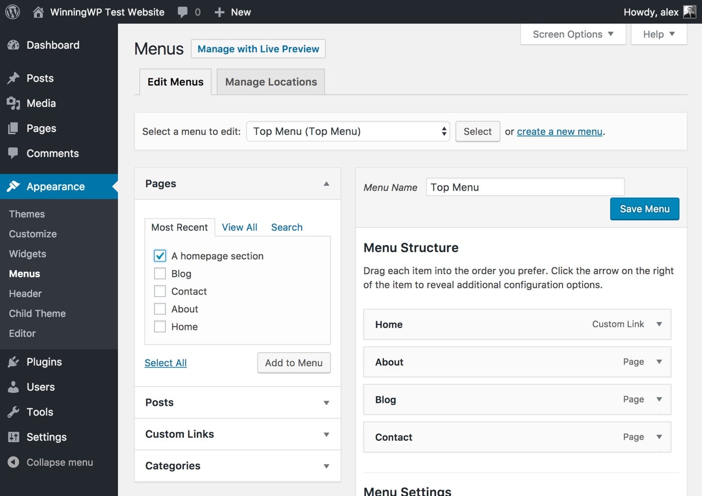
Creating a customized menu in WordPress is straightforward:
- Create a new menu, if necessary, and give it a name that reflects its content (i.e., 'primary navigation').
- Use the left-hand options to select the content you want displayed. Tick the content you want added to the menu (use View All to see everything and Custom Links to add anything that's missing), and then press Add to Menu.
- Arrange your menu by dragging and dropping the items on the right-hand side. You can expand menu items to change the Navigation Label (this is the menu item’s text), and indent menu items to create submenus.
- Save Menu when you’re done.
You can now apply your menu to a location on your site. Do this by clicking Manage Locations, and choosing your menu in the dropdown for where you want the menu to show. Typically, the main navigation will be called 'Main Menu' or 'Primary Navigation'. Save Changes, and you’re done.
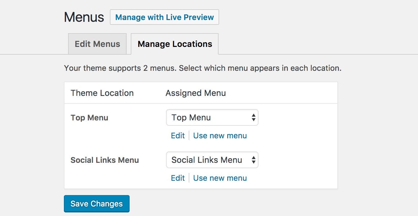
If your theme has multiple menu locations, you can either apply the same menu to multiple locations (for example Main Menu and Mobile), or head back to Edit Menus to create a new menu and then set this to display in the alternative location. Note: You don’t have to fill in all menu locations -- leave any of these blank and you won’t have a menu here.
You can also add menus to your site using widgets. This allows you to add menus in places other than the preset menu locations. We’ll cover how to use widgets next; for now, you just need to create the menu.
If you want a more powerful menu, you should get a 'mega menu' plugin. These allow you to put a huge amount of detail into your menu, with recent posts, extra detail on categories and even whole contact forms. We have a roundup of the best responsive menu plugins that shows you what the options are.
Widgets are an incredibly powerful way of customizing the look of your WordPress site. Their power is often overlooked, so don’t make that mistake! As mentioned, widgets are prebuilt blocks of content that can be added to predefined areas of your theme (known as widget areas). Here are some examples of what you can display with widgets:
- Recent posts, popular posts or posts from a specific category.
- Email newsletter signup forms.
Widgets are really easy to use, really powerful and even have a neat drag-and-drop interface. Plus, if the specific functionality you’re after doesn’t exist in your theme, it’s usually possible to add this in using a plugin. As with menus, you’re able to edit widgets from the Customizer, but you’ll likely find the dedicated setup page easier to use.
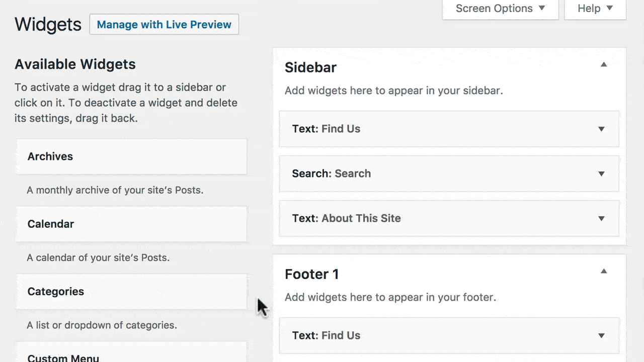
You can get started with widgets from the WordPress Dashboard by heading to Appearance → Widgets. On the left-hand side you’ll see the widgets you can use, and on the right-hand side you’ll see the widget areas that these can be dragged and dropped into. Both of the individual widgets and widget areas are accompanied by short descriptions telling you what they do.
Placing a widget in a widget area is just a case of dragging and dropping. Once a widget is dropped, you’ll be able to expand the widget to access the options. Set these how you want, save, and the changes will be made right away.
You can drag and drop as many widgets as you like into each widget area, drag and drop to rearrange widgets within an area, and even drag and drop widgets between widget areas. This makes for a very powerful setup.
As with most WordPress features, there are a couple of extra widget tricks you can apply that make the feature much more powerful.
The first of these bonuses is using plugins to add more widgets. We briefly touched on this earlier, so let’s cover this in more detail. If you have a very specific feature you want added as a widget, it’s usually possible to find this by searching WordPress + widget plugin + functionality. But there are also a couple of plugins that will be universally helpful. These are listed below:
Jetpack is one of our favorite WordPress plugins, and frequently recommended in these guides. Jetpack includes a number of widgets you’ll probably want, including your site’s most popular posts and pages, Facebook and Twitter timeline embedding, and even Google Translate to get your site in multiple languages. At the time of writing, there were 20 widgets in total, with more of these being added all the time.
To get Jetpack’s widgets, you just need to install and activate the plugin, then head to the widgets page on the Dashboard and you’ll see the extra widgets added.
SiteOrigin Widgets Bundle is another widget bundle, similar to Jetpack. This bundle includes Google Maps embeds, call-to-action and button widgets, and pricing tables, alongside a host of other useful widgets. If you want the widgets in this bundle, get the plugin.
Ultimate Posts Widget is one of the most underrated widgets you can get. This widget lets you display posts, but has an insane level of flexibility. Here are some examples of how you could use the plugin:
- Display most recent posts on your homepage, but with a featured image at a specific size, and with an excerpt from each post, limited to the first hundred words.
- Show only 'Sticky' posts on your homepage.
- On blog posts, show other recent posts from the same category, or tag as the current post in the sidebar.
- One random post from the archives in your sidebar.
For all of the above, you can choose whether to display the title, date, author, excerpt, content, read more and thumbnail. Other 'recent post'-style plugins may be slightly easier to use, but Ultimate Posts Widget straight-up gives you access to all of the parameters WordPress developers can use. This immense flexibility makes it worth using ahead of any alternative.
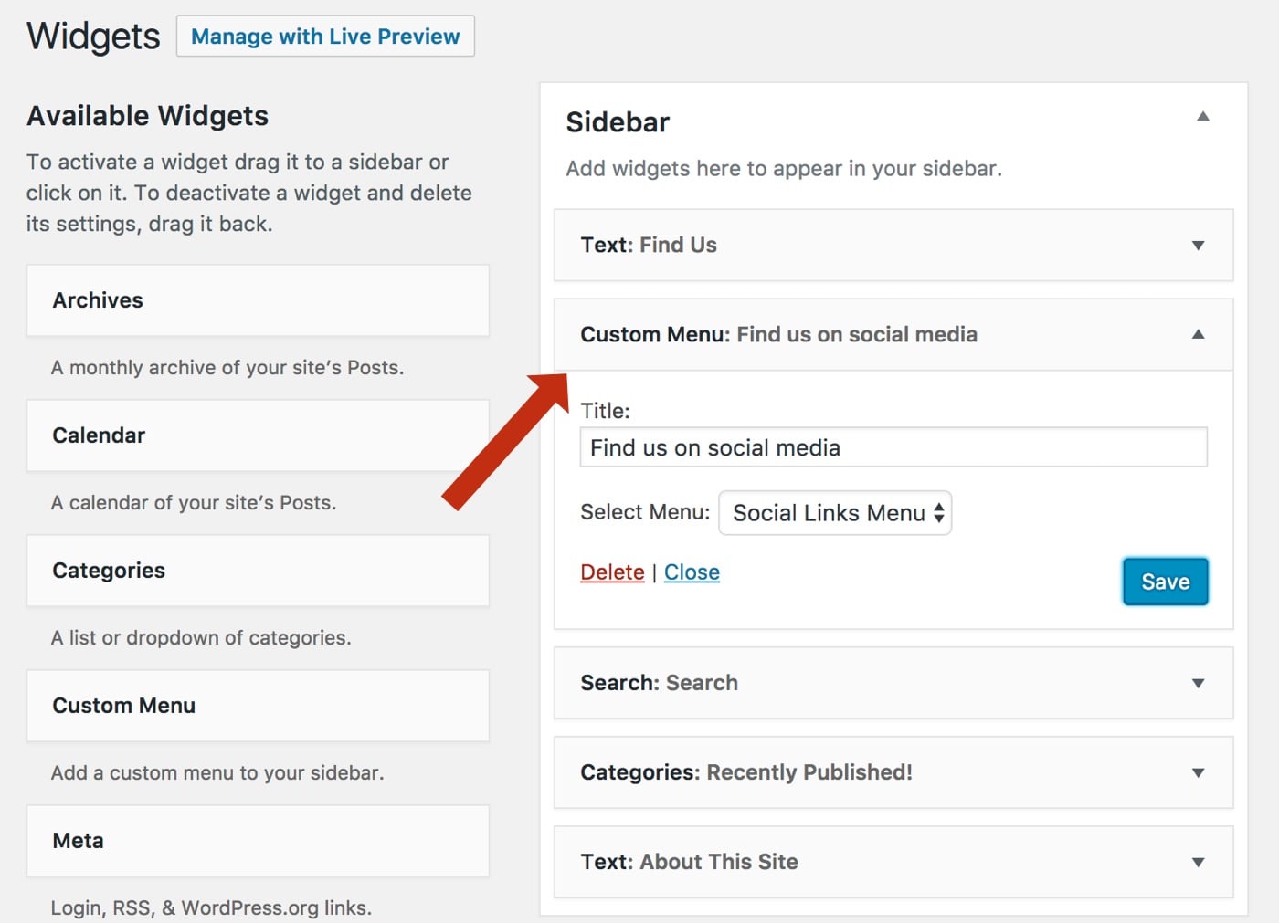
Menus don’t require a separate plugin, but deserve their own mention. It’s possible to add any of the WordPress menus created earlier as a widget, using the Custom Menu widget. Just drag and drop this where you want it, add a title if desired and use the drop down to select the menu you want to display.
Still want more widgets? Read our full post on the best WordPress plugins for widgets to get ideas and inspiration.
The next bonus is widget visibility. This lets you display specific widgets only on specific pages, and can be a game-changer for how you use widgets. Widget visibility is another feature built into Jetpack, so if you have the plugin installed you’ll have this feature already.
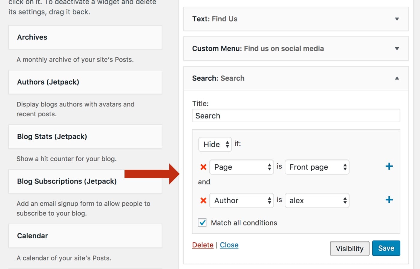
Widget visibility adds an extra button to widgets when dropped into a widget area: Visibility. Click this and you’ll be able to set conditional logic to show or hide the widget. For example, you could set the widget to Show if Page is Front Page or Hide if Page is Contact. You can even use the + to string conditionals together.
Note: Slightly confusingly, to use widget visibility uses Page differently from how it’s used elsewhere in WordPress, referring to 'any webpage on your website'. Thus, to show/hide on all posts, for example, you’d set Page is Post type: Post.
Once you have widget visibility set up, you can really start making the most of your widgets, so you may find it useful at this stage to go back through where your widgets are set to show, add visibilities and add in any new widgets. This really lets you kick on with customizing the look and feel of your site with widgets.
A final bonus: What do you do if you want to add widgets to your site outside of widget areas? You have a couple of options:
- If you just want to display a widget in a post or a page, use the Widgets on Pages plugin.
- You can create your own widget areas, but this involves getting your hands dirty with some code, so this won’t be for everybody.
- You can use a page builder to build a structured layout, and then add widgets to this layout. We’ll cover page builders next.
Menus and widgets are the two most powerful ways of customizing the content of your WordPress site. We’ll now move on to look at page builders.
Page Builders: Drag and Drop to Create the Look and Feel You Want
'Page builder' refers to a range of WordPress themes and plugins with similar functionality: A template builder that allows you to drag and drop layouts and content to get a specific look and feel. Page builders let you create websites that look very professional, but without the cost of hiring a developer or designer.
Unsurprisingly, with such a strong value offer, page builders have become incredibly powerful and popular in recent years.
Yet while page builders are incredibly popular with users for the reasons above, they have long been very unpopular with developers. We’ll spend a moment exploring why this is before moving on to consider which page builder you should be using (if any).
The unpopularity of page builders stems from the developer-held idea that page builders are poorly built, deliver a poor user experience, and are bloated with proprietary features that slow down or break websites. This is the case with some, but not all, page builders. Obviously, you should avoid poorly built page builders, and it's important to recognize that not all page builders are created equal. If you can avoid using a page builder at all, using a static front page and widgets instead, this will be the most efficient option.
If you decide a page builder is a must, there are two standout options to choose from: Tailor and Beaver Builder.
If you want to build simple layouts with basic features such as extra columns, content in the grid of your choice and simple tabs, buttons and grids, Tailor is the best choice. Tailor is free, fits in seamlessly with WordPress (using a very similar user interface to that found in the Customizer) and offers a great page builder experience. The attention to detail is important: Unlike many of its competitors, Tailor will retain your content if you deactivate the plugin. This is a flaw in many page builders, which can lock you into continued use.
Tailor doesn't have the same level of features as its competitors; there’s no built-in support for sliders, testimonials or contact forms. You can, however, add widgets to the builder, so if you have widgets letting you add these features you’ll be able to create them.
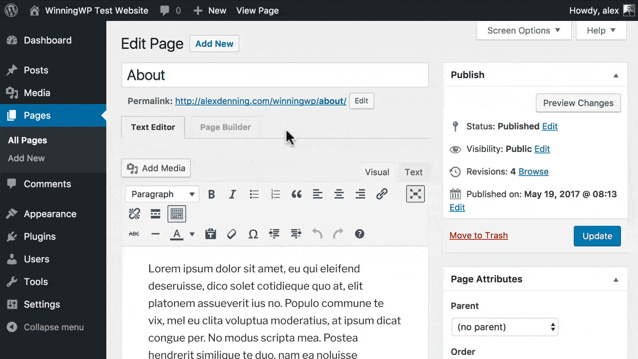
Tailor is installed like any other WordPress plugin: Head to Plugins → Add New, search for Tailor Page Builder and install and activate the plugin. You can now edit any page, and you’ll find a new button: Tailor this Page (to enable for posts and other post types, head to Settings → Tailor). This loads up Tailor’s customizer-style interface.
On the left-hand panel, you’ll see the elements you can add, and on the right you’ll see a live preview of your site. You can add elements to the page by dragging and dropping where you want them. If you drop the element on the right or left-hand side of the page, this will create a column, which you can then resize by dragging the border. Once an element is added, click it to edit the content.
Repeat this process until you have the look you want -- when done, you should test how your page will look on mobile and tablet devices using the icons in the bottom left. If everything looks good, hit Save & Publish! Exit Tailor by pressing the X in the top left.
You can add extra features to Tailor, including restricted content, video backgrounds and animations using the (also free) Tailor Advanced Features plugin.
For simple layout building, you can’t beat Tailor. It’s free, fast and very easy to use. If you’re after a more feature-filled page builder, however, you’ll need to use our second recommended plugin.
For more complex layouts, you should use Beaver Builder. Beaver Builder starts at $99, and is the best feature-rich page builder you can get. You get everything you need to create professional designs -- including prebuilt layouts you can import -- and the plugin is well built, well supported and constantly updated. You’ll need to pay for the plugin (there's a free version, but Tailor is superior), but the cost will be well worth it for the hugely powerful plugin you'll get. Get the plugin and download the plugin’s ZIP file.
On your WordPress Dashboard, head to Plugins → Add New → Upload Plugin and select the ZIP file you’ve just downloaded. Install and Activate the plugin, and you’ll be taken to a welcome screen for Beaver Builder (you can get back to this at Settings → Beaver Builder). Under Modules, you can choose which modules are enabled (you should come back later and disable those you’re not using to reduce the weight of the plugin), and under Post Types you can select the post types you’d like the plugin to work with. If you want anything other than pages, enable this here.
Similar to Tailor, you can start using the page builder by heading to the page on the site you wish to customize, and clicking the Page Builder tab. On the right-hand side you’ll have the builder options: Row layouts, the basic and advanced modules for adding content, and all of your WordPress widgets. All of these can be dragged and dropped onto the live preview of your site; doing so also brings up a settings lightbox where you can specify how you want the content to display.
You can hover over both the rows making up the general structure and individual modules to access options, such as move around, edit, duplicate and delete. Use these to arrange your content how you want. You can add extra modules by pressing the Add Content button.
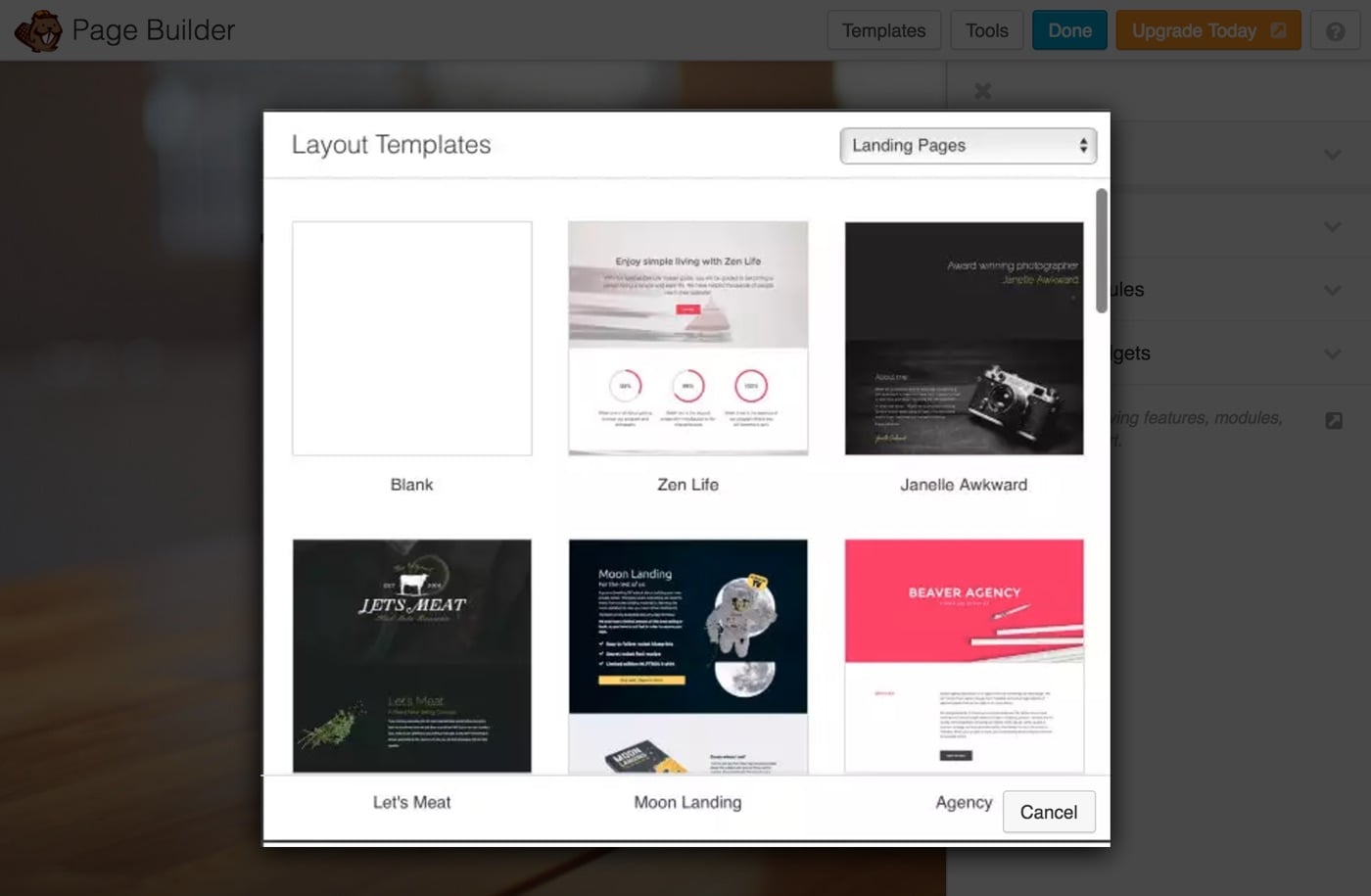
A major advantage of using Beaver Builder is its support for templates. These allow you to quickly import professionally designed templates and then customize these, significantly speeding up the time required to design your layout. Add these by clicking the Templates button, selecting your desired template and then either replacing or adding to your existing layout. These templates are a fantastic way of getting a professional design for your site, so are well worth looking into.
Finally, the Tools button lets you load up some general settings, duplicate the entire layout and customize the CSS and JavaScript loaded on the page. Press Done when you’re finished, and you’ll be asked how you want to proceed: You can either publish changes right away, save and don’t publish or discard changes. If you’re publishing, you’ll be shown how your page looks, and can admire your handiwork!
Beaver Builder is remarkably intuitive. Following the instructions above and just testing it out will get you most of the results, but if you need extra assistance then read the Beaver Builder knowledge base.
One final note: If you really want feature-rich layouts, but don’t want to pay for Beaver Builder, the free version of Elementor is a reasonable compromise. Beaver Builder does have its own free version, but this excludes most of the modules that make Beaver Builder attractive in the first place.
For a full discussion on the different page builder options, see our post on the best drag-and-drop WordPress page builders compared. If you do go with a page builder, be sure to keep an eye on your site’s loading time -- even the best page builders can slow down websites. See our full guide on how to make your WordPress site faster for more details.
Understanding CSS Basics
Making more advanced changes to the look and feel of your WordPress site requires a basic understanding of the coding language that controls how your site looks (you won’t necessarily have to write any code, so even if this sounds daunting, hang in there). This is going to give you the ability to make very precise changes to your WordPress site and get precisely the look and feel you want. This is where the powerful changes happen!
The coding language is called 'Cascading Style Sheets', or CSS for short. CSS is typically stored in a CSS file. For WordPress themes this is primarily the style.css file. You may have heard of or seen this file before -- but now you can understand what it does.
To more effectively change the look and feel of your WordPress theme, you can get away with just learning three basic rules and principles.
The first and most important thing to know about CSS is it aims to style the HTML outputted by WordPress, your theme and your plugins. This means the two parts need to be looked at in tandem: CSS without HTML means nothing.
CSS knows which parts of the HTML to style, as 'blocks' of HTML have selectors known as IDs and classes attached to them. The CSS can then be used to specify how those IDs and classes should be displayed. IDs and classes are functionally the same thing, but IDs can only be applied once per page, and classes can be applied multiple times per page. Additionally, CSS can target specific elements of your site such as links, paragraphs and headings.
There are a number of tools that make the process of identifying IDs, classes and elements a lot easier, which we’ll look at later. For now, you just need to be familiar with theoretically what they do.
The second most important thing to know about CSS is what the 'cascading' part of its name means. CSS applies the styling most relevant to a selector first, and then 'cascades' through other styling that could apply to that selector in order of relevance. Here’s an example to illustrate this: If you have a paragraph in a blog post, the CSS cascade might look something like this:
- Styling targeted to paragraphs.
- Styling targeted to blog posts.
- Styling targeted to blog posts and individual pages.
- Styling targeted to every page on your website.
We run from most relevant to least relevant. If two parts of the cascade have instructions for the same thing -- for example, font size -- then the styling from the most relevant part of the cascade is applied.
Finally, it’s very useful to know the very basics of how the CSS language is written. Don’t worry if this seems overwhelming at the moment, the goal is for you to understand the syntax. Once you start using CSS this should make more sense. You may wish to refer back to this later.
- CSS code is written using the format:
ID, class or element { things that apply to that ID, class or element }.- IDs have
#before them, and classes have.before them. For example,#footeris an ID and.navigationis a class. - The most common elements are:
h1,h2,h3and so on for headings.afor links.pfor paragraphs.ulfor bullet point lists.olfor numbered lists.*for everything.
- IDs, classes and elements can be stacked to be more specific:
.blog-post pwould, for example, target paragraphs inside the classblog-post.
- IDs have
- The 'things that apply to the ID, class or element' use the format
property: variable;. For example,background-color: blue;.- Variables for units of measurement are typically written in pixels or as percentages. For example,
width: 100%;orfont-size: 16px.- Note, technically you should be using relative units of measurement known as REMs. You may see these used in your theme, but for our purposes they’re too complicated. Read this if you want the extra detail.
- You can have multiple properties applied to the same ID, class or element. For example,
background-color: blue; font-size: 16px;. - There are a lot of properties, most of which use self-explanatory names. You can see a full list of CSS properties here.
- Variables for units of measurement are typically written in pixels or as percentages. For example,
- An example of full syntax thus looks as follows:
.blog post p{ background-color: blue; font-size: 16px; }.
Understanding these three points about CSS will ensure everything makes sense when we come to actually changing the look and feel of your site. We’ll now cover how you can make CSS changes without having to write any of the CSS. After that, we’ll cover how to write your own CSS and make further advanced changes with child themes.
This next section will empower most people to make the changes they want -- after that, we’re on to the really advanced stuff!
Changing Look and Feel with SiteOrigin CSS
SiteOrigin CSS is a free plugin that lets you edit CSS without knowing any CSS. It’s like a page builder, but for CSS: You get a visual editor that works out which IDs, classes and elements to target, and an instant preview so you can see what your changes will do. All you need to do is change the variables to get the results you want. This gives you huge power for customizing your site.
If you’ve been frustrated with the limitations of the Customizer, theme options and page builders, this plugin is going to get you 80% of the results you’d have from learning CSS -- but you don’t need to fully learn CSS. The basics we covered in the previous section also aren’t essential, but will help everything make sense -- and, if something doesn’t behave as you’d expect, you’ll be in a better position to troubleshoot.
Start by installing the plugin. From the WordPress Dashboard, head to Plugins → Add New. Search for SiteOrigin CSS, and then install and activate the plugin. With the plugin activated, head to Appearance → Custom CSS. Click the eyeball icon, and the plugin will load up its editors. On the left and bottom is SiteOrigin CSS’ customizer, which we’ll be using to edit your site.
Move your mouse over the live preview of your site, and you’ll see lots of blocks highlighted. This is SiteOrigin CSS recognizing the different IDs, classes and elements your site is using. Click on any of these, and you’ll be able to edit how it displays. You’ll see the CSS’ cascade along the bottom (this will be useful for making more advanced changes) and you can start making changes using the left-hand panel.

For example, click on a paragraph on your homepage, and you can change the text color, font size or any of the other parameters on offer. Try this out -- you’ll see the changes made immediately. You can click to the decoration and layout tabs to access more parameters, and you can revert any changes, so try it on a couple of elements to get to grips with how SiteOrigin CSS works. At any time, you can press the tick icon to see the code generated from what you’ve selected; Save CSS to apply these changes or delete the code to keep your site without changes.
The CSS basics covered in the previous section are especially useful for deciding which part of the cascade you want to be styling; these are the 'more advanced changes' we just mentioned. If you click on your logo, for example, you may find the cascade is something like:
.logo a:hover
.logo a
a:hover
.logo
a
*
You’d thus know from our theory that .logo a refers to 'anything with the class logo and a link', whereas a applies to all links. The only new thing here is a:hover; this refers to links when the mouse hovers over them. Thus, to change how your logo looks regularly, you’d need to click .logo a, as the :hover variant only applies to the logo when hovered over. Recognizing these kinds of details will let you to make the vast majority of changes you want on your site.
If you want to access a different page on your site to change the CSS there, click a link to that page and then use Navigate To in the bottom right. You can also use the address bar at the top of the site preview to access specific pages directly.
It’s now just a case of using SiteOrigin CSS to make all of the changes you want! You may find it useful to test making your browser window smaller and larger to make sure your changes won’t affect how your site looks on mobile or tablet devices. When done, Save CSS, check your site and admire your handiwork.
SiteOrigin CSS is an incredibly powerful tool that can give you all of the benefits of CSS, but only requires you to learn the very basics. SiteOrigin have a brief series of video tutorials that you may find useful. Remember, too, to refer back to the CSS basics above; with the context of SiteOrigin CSS, you should find the theory makes a lot more sense. We can now move on to actually writing your own CSS!
Changing Look and Feel with CSS
Writing your own CSS gives you full and precise control over the look and feel of your WordPress site. SiteOrigin CSS will let you make 80% of the customizations you’d plausibly want to make, but for the final 20% you’ll need to write your own code. Writing your own CSS has the advantage of being more efficient and more reliable than any of the alternatives we’ve discussed so far, and it’s not as hard or as daunting as it may sound.
The secret weapon for writing your own CSS is the Inspect Element tool built into many browsers. In this section we’ll be using Google Chrome, but most browsers have a very similar feature. Inspect Element is like SiteOrigin CSS, except in your browser. You right click on the bit of your site you want to 'inspect', click Inspect Element, and the browser shows you the HTML output on the left and CSS on the right, with the most relevant code at the top and cascade going down the page.

As with SiteOrigin CSS, you can make edits and see them right away! You can change existing CSS by clicking on it and making changes, or click between the curly brackets to add new properties. The main difference is you get fewer prompts: If you want to change the font-size and this isn’t already present, you’ll need to know this is the appropriate property (the full list of CSS properties mentioned earlier will come in helpful).
Try this out: Inspect Element and change the font-size of text in a paragraph on your homepage.
The second key difference between Inspect Element and SiteOrigin CSS is with Inspect Element you’re only making changes in your browser; refresh the page and the changes are gone. To apply the changes to your site, you’ll need to copy them over to WordPress.
There are two options for copying your own CSS into WordPress:
- WordPress includes an Additional CSS panel in the Customizer: Find this from the WordPress Dashboard by heading to Appearance → Customize → Additional CSS. This has the advantage of giving you a live preview, but the disadvantages of a small panel that makes organising lots of code difficult, and you’ll lose your code if you change theme.
- The alternative is to use the Simple Custom CSS plugin. This is effectively the same thing as in the Customizer, but you have more space to write your code, and you keep your code if you change themes. You will, however, lose out on the live preview.
Beginners will likely find the Customizer more useful, and those with some prior knowledge will find the Simple Custom CSS plugin more useful. In this section, we’ll be using the Customizer.
Copying your code requires copying all of the code for the elements you’ve changed, including the ID, class or element, opening and closing curly brackets ({ }), pasting this into your CSS editor of choice, and then deleting the parts within the curly brackets you didn’t change.
If you were changing the font-size of your logo in the 2018 WordPress theme, for example, you’d make the change, copy all of the code needed and paste it into your CSS editor.
The code you’d paste would be:
.site-title, .site-title a { color: #222; opacity: 1; font-size: 48px; }
Deleting the parts you didn’t change would leave you with:
.site-title, .site-title a { font-size: 48px; }
Save those changes, and you’ll see them made right away on your site. If things don’t look quite right, don’t worry: You’ll find some common troubleshooting pointers at the end of this section.
Here’s a second example where we’re amending an existing variable and adding a new one. Sticking with the 2018 theme, let’s say you want to change the background and text colors of blog posts. Using Inspect Element, you’ll find .site-content-contain is the appropriate CSS class, and the existing code is: .site-content-contain { background-color: #fff; position: relative; }.
You’d use Inspect Element to get the look you want, and use the following code: .site-content-contain { background-color: grey; position: relative; color: white; }.
Copying this across and deleting the unchanged parts would thus leave you with: .site-content-contain { background-color: grey; color: white; }. Again, save the changes, check your site, and you’re done.
The main advantage of writing your own CSS over using SiteOrigin is you can be a lot more specific and make bigger changes much more easily. Hovering over HTML output in Inspect Element gives you a much clearer picture of how the structure of your site fits together, and makes it a lot easier to make the bigger structural changes. It’s a lot easier to find, for example, that .wrap rather than .content is controlling the width of your content area.
Inspect Element on the content area and move up through the HTML until you find the full width of your site selected. You can now change your site’s width in Inspect Element, check everything works in smaller or larger windows (when changing widths using max-width instead of width can be helpful) and then copy the code across. These sorts of changes are much more difficult to make with the same level of precision using SiteOrigin CSS.
Writing your own code does, of course, increase the likelihood that something goes wrong. Here are some problems you may run into:
- 'I made a change and now lots of things look like that!' Your CSS isn’t specific enough. You’ll need to double check how the CSS cascades and make sure you’re targeting the right class, ID or element by adding more of these. For example, change
ato.blog-post a. - 'I made a change but it doesn’t show up.' It’s probable your CSS is being overwritten by other code, possibly from a plugin, which thinks it’s superior to what you have. You fix this by adding
!importantto your code just before the closing;. For example,.blog-post a{ color:blue!important; }.Use this only when necessary, though -- it’s generally not good practice. - 'I can’t find a class, ID or element to copy.' Inspect Element defaults to
element.styleif it can’t find a class, ID or element to apply to. This adds the styling directly to the element in HTML, so can’t be copied to an external stylesheet. In this situation, you’ll typically need to copy the next cascade down instead. If lots of IDs, classes and/or elements are strung together and most are greyscale, only copy the ID, class or element in black, as this is the one being actively applied. - 'I messed something up!' Just delete the code and start again. Both the Customizer and Simple Custom CSS make it very easy to remove code with no long-term consequences: Everything will just revert to how it was before your changes.
Working through these troubleshooting pointers should get your code back on track. If you need more guidance, check out the excellent CSS Tricks beginner guide, which includes some great videos and tutorials.
Writing CSS is the most powerful method most people will need to customize the look and feel of a WordPress website. It’s also the most difficult and daunting technique we’ve covered so far, but it’s a skill that can stay with you for a long time. We’ll now move on to the final -- and most advanced -- method for changing your site.
Creating Child Themes for the Ultimate Level of Look and Feel Customization
A child theme is the ultimate step for customizing the look and feel of your WordPress site. This is WordPress’ built-in feature, specifically designed for making extensive customizations to your website. This should be your last port of call: For most of the changes you’ll want to make, the methods suggested above will be more than capable. Child themes are the final and most technical customization method we’ll cover in this guide.
A child theme runs in parallel to its 'parent theme', inheriting all of the styling and functionality of this parent theme, and only making changes where specified. Thus, a child theme with only the code required to set itself up would look and behave exactly the same as the parent theme.
Thus, child themes allow you to make sustainable changes to your theme’s files. If you were to edit the parent theme directly, whenever you updated the theme the files would be overwritten and your changes lost. Using a child theme, however, lets you keep both your changes and the parent theme up to date.
Using a child theme requires some knowledge of how the individual files (known as template files) in a WordPress theme work. WordPress uses a small number of files to generate all of the pages on a WordPress site: The single.php file, for example, generates all blog posts while the home.php file generates the homepage. Some files, such as header.php, sidebar.php and footer.php can be used as reusable parts called by other files. This lets you make a change to your header once in the header.php file, and have it applied across the whole site. You can see this chart for the full list of template files.
A child theme in practice requires two files to get set up: A style.css file for the CSS and a functions.php file to import the functionality of the parent theme. You can then, if you wish, duplicate template files from the parent theme into the child theme and make changes to those duplicated files. If WordPress finds a template file in the child theme’s folder, it will use that; if not, it uses the parent theme’s file.
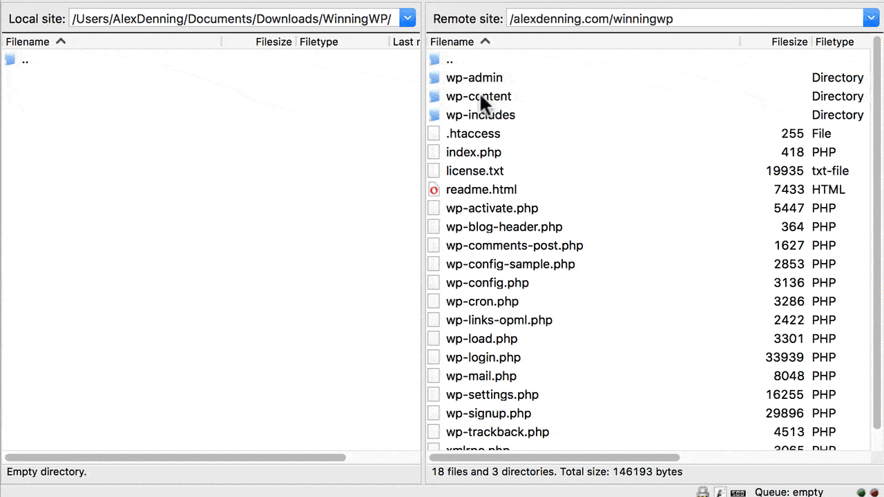
Making changes is now a case of creating extra files as necessary and changing some code. You’ll need FTP access to your site to duplicate and edit template files. FTP, or 'File Transfer Protocol', lets you move files between your computer and web host. You'll need an FTP client, and the best free FTP client is FileZilla. Whether you're a Mac or Windows user, getting FileZilla set up is very straightforward. Download the Client version of FileZilla and follow the prompts to install. You’ll also need FTP details from your web host -- most make these readily accessible from their user areas, otherwise look in cPanel.
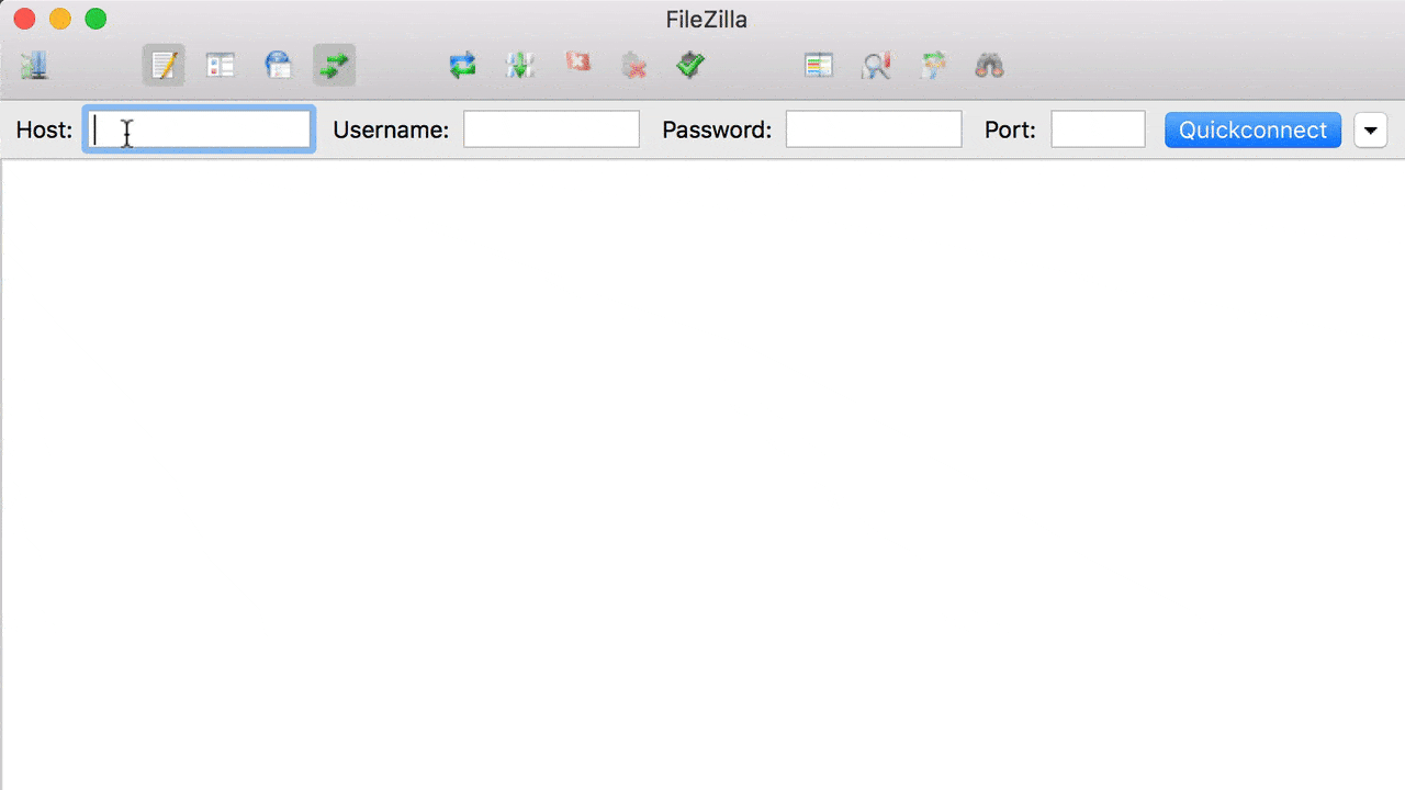
Open FileZilla and enter your FTP details into the top bar, then press Quickconnect. Unless your host has told you otherwise, you can leave the port field blank. Once logged in, you’ll see files on your computer on the left and files on your server on the right. We’re interested in the files on your server. Navigate to /public_html/yoursite.com/ if these are options, and then /wp-content/themes/parent-theme-name/. You’ll need to download the files you want to edit in your child theme, and then re-upload them into your child theme’s folder (in FileZilla, back up one level, and then click /child-theme-name/).
Once files are in your child theme’s folder, you can right click, and then select View/Edit to start making changes to the files. When editing template files, you’re editing the PHP code before WordPress has processed it, so the broad structure will be the same as when you investigated using Inspect Element, but you’ll be seeing the PHP code to be processed rather than the finished product. Make sure to look out for any PHP loops or 'if' statements: If you remove an if statement, you’ll also need to remove the endif. Similarly, if you remove a while, you’ll need to also remove the endwhile. If you miss these details, you’ll be greeted with a white screen when loading your site, so look out!
You’ll be able to make very basic changes yourself. You’ll need to use Inspect Element to identify what it is you wish to change, and then use the template file hierarchy chart to see which file needs editing. As an example, to remove the next/previous post feature from the 2018 theme, you’d look at Inspect Element and see this is closely related to the post content, then look at the chart and see you should look for single-post.php or single.php. The 2018 theme has no single-post.php file, so single.php is the one to go with. Download this file to your computer and then re-upload in the child theme folder.
View/Edit the single.php file from the child theme folder and start looking for mentions of next/previous posts. You’ll find a section starting the_post_navigation: This is what we’re looking for! The indents helpfully show you where this section starts and ends, so delete the whole lot, including the ending ) ); on line 33 of the file. Save the changes, upload with FileZilla and check your site, and you’ll see the change made. If anything has gone wrong, you can just delete the file in FileZilla (so WordPress looks for the template file in the parent theme) and start again.
Don’t be afraid to try things out and make some changes! This will be the best way of learning. This trial and error method is good for small changes, but you may find it helpful to read up further on the subject. Smashing Magazine has a great child theme tutorial, WPShout also has a good tutorial, although this is more developer-focused, and we have a recap on how to create a child theme if you need this section explained in different language.
Child themes are the ultimate way of customizing the look and feel of your WordPress site. This is what the world-leading experts are doing, and, if you take the time to learn how this works, this is something that can serve you very well for a very long time on every WordPress site you work on.
Customization Services to Change the Look and Feel for You
We’ve looked through all of the ways you can change the look and feel of your WordPress site, but what do you do if you don’t want to make these changes yourself? The easiest way to make major changes is to get a professional to help. As you would expect, this will be much more expensive than making the changes yourself or purchasing a premium plugin to do the job for you, but you'll get precisely what you want at a high quality.
Innovation around customization services of WordPress sites has led to the emergence of 'as-a-service' customization, which productise the relationship between you and the developer doing the work on your site. This gives you a guarantee of quality, means you don’t need to worry about finding a developer, and standardises pricing. If you need very specific changes that the tools we’ve recommended so far can’t handle, a customization service is the way to go.
It’s worth noting that you should be prepared to pay for quality when dealing with customization services. Poor-quality code from cheaper, less-qualified developers can lead to more headaches and higher costs in the long run, as you could well end up having to hire a more expensive developer to untangle the problems created in the first place. Spend more upfront on something that’s going to work: $60 to $100 an hour should be your ballpark figure.
There are three customization services and marketplaces you can turn to:

Codeable is a customization marketplace where you can submit the work you want done, budget and timeframe required, and have it sent to a list of pre-approved WordPress developers. Interested developers can then 'bid' for your project, and you choose who you want to work with, based on their price, bid details and experience. The bidding system theoretically leads to lower prices, and you get peace of mind both from Codeable pre-approving their developers, and from the option of being able to turn to Codeable if anything goes wrong between you and the developer doing the work.
WP Curve is a true 'customization-as-a-service' offering, where you pay a monthly fee of $79, but have access to unlimited 'small' customizations (where 'unlimited' and 'small' are defined as whatever WP Curve considers reasonable). This doesn’t suit one-off big customization projects, but if you have frequent ongoing requests you’ll get very good value.
Envato Studio is a customization marketplace where individual developers can advertise their services at fixed prices. The developers list what they’re willing to do at what price, and you choose who you want to work with. This 'open marketplace' probably means Envato Studio is offering lower prices than its competitors, but you have to do the work to find the developer -- and have to rely on reviews rather than an outright guarantee of quality.
Paying for customization services will almost certainly get you faster and better results in the short run, but, bear in mind, applying the tools and resources from this guide will be much more efficient in the long run. Do whichever's best for you and your site!
Conclusion
This guide has exhaustively covered everything you need to know to customize the look and feel of your WordPress site.
The easiest options: Using the Customizer, theme options, menus and widgets, and page builders, are incredibly powerful tools, and will be sufficient for a lot of people. Those needing something extra can turn to SiteOrigin CSS, and those wanting complete control can customize their CSS or create a child theme.
These options are a key part of WordPress’ strength: There’s something for everyone and, of course, if you don’t want to do the work yourself, you can hire somebody to do it for you. Whichever way you do it, the result is a highly professional website that looks precisely how you want it to.
That concludes our guide to changing the look and feel of your WordPress site, but we’re not done! You should read more guides in this series! See more WordPress guides here.